Quo Wealth Platform
Fund & Wealth Management • UI Design • 2018
In 2016, TradingScreen kickstarted a new SAAS trading platform to serve the wealth management market, as a spin-off of its main software, TradeSmart, a highly complex trading platform. TradingScreen has $5.3 Trillion client assets under service.
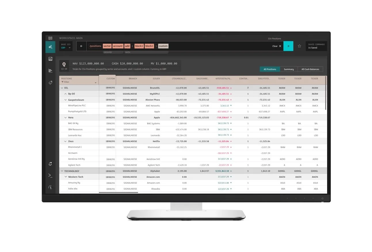
The North Star – Quo would be the smart personal digital assistant for Fund & Wealth Management. I designed a powerful Command line-based platform with direct trading from positions - A one-stop shop for Wealth managers.
PRODUCT Principals - QUO SHOULD:
Always deliver up-to-date position details (sod + market data).
Allow me to trade compliantly across multiple custodians.
Allow me to efficiently reach parts of my portfolio, quickly.
Allow me to be precise in what I’m looking for (filtering + search).
Help me build the right combination of criteria to find what I need.
Be reusable, help me/others find the same thing again (saving/sharing).
Be Bloomberg-like in speed, but modern in UI design

Future design proposal with a kick-off space showing a daily summary by the time you are ready for your morning coffee.


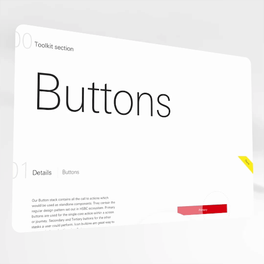
Redesigned table and command line query builder. Plus a new interface layout with an imporved hierarchy, IA and cleaner look and feel.


Starting point – I picked up the design patterns and evolved for user testing in phase 1


Morgan Stanley
Investment RESEARCh Products • UI Design • 2021
I worked in the Research and Data department for Morgan Stanley, the 6th biggest bank in the world, delivering UI designs for a complex Market Screener which I helped innovate with new UX patterns brought forward to the business. I also delivered UI designs for the flagship chatbot assistant which was integrated across multiple touch-points and communication channels. Finally, I helped the team with design updates to the Research App and Portal.
Alongside my regular sprint delivery work I also consulted with the Central Design System team and helped them deliver strategy and BAU work.
New Market Screener for Risk Reward analysis – early iteration included a command line building blocks which once tested evolved to the easily digestible filter blocks and summary bar. The summary bar tested very well with users and was pushed forward.


AskResearch Chatbot Assistant built directly within the Institutional banks clients’ front devices – integrated into Skype and Desktop Applications, with ambitions for it’s own independent app.

Emnos
Retail In-Store Analytics • UI Design • 2018
Emnos is a leading provider of automated, data-driven solutions for Retail Category Management and Assortment Planning. This is a specialised expert B2B complex tool designed specifically for in-store assortment. I designed the UI of their platform while working for The Economist’s data design agency, Signal-Noise.
After a few rounds of discovery and iterations I landed with these data-visulations and design patterns to work across the platform


Catalyst App Proposal
UI & IXD • 2017
Catalyst is Tigerspike's problem-solving practice, aligning business priorities around measurable goals. Aiming to give teams focus, alignment and understanding of why they're making decisions. We designed an App to help the team facilitate the workshop sessions.
As a result of this product exploration, I came up with an idea to reduce the drop-out rate of teams stopping the Catalyst process. The idea was developed by Tigerspike Next and released to the App Store … Brill App became a Top 10 productivity trending App.

Data graphs using colour to communicate a project’s confidence ratings at a glance so product managers can track progress quickly and in-depth directly form their mobile phones.
The Problem
Catalyst GM pitch
The Catalyst methodology was evolving within its birthplace - Tigerspike Dubai - from the numerous occasions of trailing, testing and refining during our monthly TM days, to the very hard work being put into tailoring it towards our challenging clients but also to support our processes, senior management in Dubai were happy enough pitch it globally during the GM Summit in Tokyo. They needed visuals and a prototype to sell the methodology to the head-strong GMs and other key stakeholders - in hope of it becoming the global initiative that it is today.

Data design exploration – using an abstract graph as the core visual but using colour to denote overall meaning of confidence within a project pillar to express ‘feeling’.

Workflow and end designs of the Tigerspike Catalyst App proposal
FX Customer Trading App
RHB Bank • UI Design • Singapore • 2017


Volatility data visualisation
Data Visualisation • Desktop Tool • 2014
This was a self-initiated project for IG Index where I designed a concept which would be an industry-first data visualisation in financial / FX trading. After a few hand sketches of the ideas, with a process of refinement and divergent thinking, I whittled the graph down to the fundamental concept of a year being represented in bars of daily volatility. Showing traders the range of movement one could potentially profit from.


Data processed and used to plot the real graph
After I presented the conceptual designs to the design group, there was clear excitement about this industry's first volatility graph visualisation. I set out to accumulate the data to plot the graph with real annual data, however, the data team said it would have to go into their backlog - which would take weeks. So I decided to process the equations out myself; day-highs minus day-low, each day, for one trading year. I then replotted the graph with the real data. The results made me proud, as predicted the graph revealed periods of volatility in a beautiful way.
Real Data Graph:

Web Tool For Day Traders
So with the concept proven with real data, and the volatility graph still demonstrating annual patterns, I set out pushing the concept further. I created an online tool which inter-day traders would use to predict periods of high volatility within markets.


Other work